|
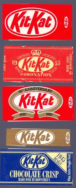
HOW IT BEGAN The 1930's KIT KAT logo has a great simplicity and elegance - like my other favourite '30's designs, the Black Magic box and the duMaurier packet. But it wasn't just the ellipse and lettering that appealed; it was the only chocolate bar with its wrapper going round the ends rather than the sides. And the foil was placed at an angle to the bar! When special wrappers were produced to mark 50 years of KIT KATs I kept one - and one of the golden two-finger bar wrappers. Then as styles changed and varieties were introduced - different flavours, cubes and balls - I kept saving them, even though Nestle's treatment of the lettering is an abomination. |
|
KIT KAT |
|
 |
 |
|
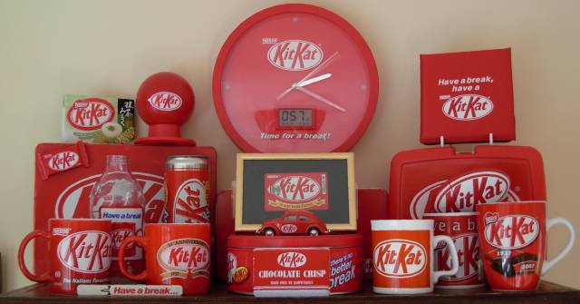
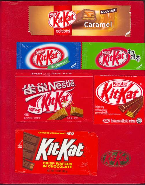
LEFT: top is the simplest and best; next the coronation wrapper; then 2 golden anniversary wrappers; lastly, a 1995 special edition. BELOW: my collection of KIT KAT items, mostly given to me as presents. RIGHT: Some of my 91 wrappers from around the world resting on my KIT KAT album. |